
A bright lamp can still make a carefully chosen blue turn disappointingly purple elsewhere.
A painted miniature can look perfectly balanced on the desk, then strangely warm by a window. A fabric swatch that seemed like a clean grey under the lamp may reveal a green or pink cast in another room. That familiar “it looked right last night” moment is usually not a brightness problem.
Brightness helps with seeing fine brushwork, pencil lines, and surface texture. But when the work involves mixing paint, matching thread, selecting markers, or judging printed proofs, the lamp also needs to show colours faithfully. CRI—Colour Rendering Index—describes how naturally a light source renders colours compared with a reference light of the same colour temperature. A higher CRI does not make a lamp brighter; it makes colour decisions at the desk more likely to hold up in daylight and under other good-quality lighting.
- CRI measures colour rendering, not brightness.
- A high-output lamp with poor colour rendering can still distort colour choices.
Start with a 90+ CRI lamp
Colour Rendering Index (CRI) describes how faithfully a light source reveals colours compared with a natural or reference light source. It is scored from 0 to 100: the closer to 100, the less likely paints, papers, fabrics, inks, and skin tones are to look misleading.
For an art desk lamp, 90 CRI or higher is the practical starting point. This is the range that makes comparing swatches, mixing paint, selecting thread, and working from printed or photographic references noticeably more dependable. It does not make every colour decision perfect—surrounding light and the material itself still matter—but it removes a common source of unpleasant surprises.
An 80 CRI lamp is often perfectly serviceable for reading, keyboard work, tidying a desk, or general task lighting. Under it, however, subtle differences can flatten or shift: a warm grey may seem greener, a muted red less distinct, or two near-identical blues harder to separate. The problem may only become obvious when the work is viewed in daylight or another room.
CRI is therefore best treated as the first filter, not a luxury feature. Once a lamp clears 90 CRI, compare its brightness, beam coverage, arm adjustment, and colour temperature. A high-CRI lamp that cannot light the whole working area evenly still makes colour matching harder.
Look for “CRI 90+” or “Ra 90+” in the specifications. Vague claims such as “daylight,” “natural,” or “full spectrum” do not, by themselves, confirm high colour rendering.
When 95+ CRI earns its price
For casual sketching, note-taking, line work, and monochrome studies, a reputable 90+ CRI lamp is usually the sensible stopping point. It makes colours look credible enough to work comfortably, without paying a large premium for distinctions that may not affect the finished piece.
A 95+ CRI lamp becomes more worthwhile when the desk is used to judge small differences that must match elsewhere. This includes:
- mixing close paint colours or selecting subtle values in coloured pencil;
- drawing or painting skin tones, where a slight red, green, or yellow cast is obvious;
- matching thread, yarn, paper, or fabric to an existing item;
- checking hobby prints, decals, or swatches before committing to a project;
- photographing artwork at the desk for sharing, listings, or records.
The practical question is not whether 95+ CRI makes every drawing better. It is whether an incorrect colour choice would be annoying, costly, or hard to undo once the work leaves the desk. A quilter choosing between nearly identical blues, for example, gains more from the upgrade than someone making graphite thumbnails.
Even then, lamp quality cannot guarantee a perfect match in daylight, a studio, or a client’s home. Before finalising a colour-critical piece, it helps to view it under the lighting where it will actually be displayed. 95+ CRI reduces surprises; it does not eliminate the need for a final real-world check.
Check R9 before trusting a high CRI claim
A lamp’s familiar CRI/Ra score is an average of eight muted test colours. Saturated red—called R9—is not part of that average. As a result, two lamps advertised as 95 CRI can render a scarlet paint swatch, warm terracotta, or rosy skin quite differently.
For art work, R9 is the most useful second number to request after Ra. It is especially revealing when judging red pigments, wood tones, oranges, burgundies, and warm neutrals. For broader context on how CRI lighting is interpreted, it helps to treat Ra as a starting point rather than a complete colour report.
Practical R9 targets
- R9 below 50: reds may look noticeably muted or brownish; not ideal for colour matching.
- R9 of 50–80: generally workable for casual sketching and crafts, though warm colours may still shift.
- R9 of 80+: a solid target for an art desk lamp.
- R9 of 90+: reassuring for close paint, fabric, print, and skin-tone checks.
Some manufacturers also publish TM-30 results. Its Rf fidelity score and Rg gamut score examine more colours than CRI, so they can add useful nuance. They do not replace a clear Ra and R9 listing, however. A lamp with published test data—ideally Ra, R9, colour temperature, and TM-30 where available—is usually a safer choice than one making vague “full spectrum” or “studio quality” claims.
Choose a Kelvin range for the task
Kelvin (K) describes whether light appears warm, neutral, or cool. It does not indicate colour fidelity: a 3000 K lamp can render paint accurately, while a 5000 K lamp with poorer spectral output can still distort it. CRI and R9 answer the rendering question; Kelvin sets the working atmosphere and visual reference.
Practical working ranges
- 2700–3000 K: warm and restful, useful for sketching, journalling, or evening work where a cosy appearance matters more than matching daylight.
- 3500–4000 K: a balanced choice for long drawing, crafts, and general desk tasks. It is often less harsh than cool white while keeping whites reasonably neutral.
- 4500–5000 K: helpful for close colour comparison, detailed painting, and print work intended to resemble daylight. For broader context, compare comfortable reading colour temperatures before treating a cooler setting as automatically better.
Adjustable-CCT lamps are convenient, but their advertised CRI may apply only to one setting. Some retain strong rendering across the range; others shift noticeably, especially at very warm or very cool ends. Checking the manufacturer’s CRI and R9 data for the chosen setting is safer than assuming a single headline number covers every mode.
Finally, inspect a finished piece under the lighting where it will actually be seen: window daylight, a warm living-room bulb, gallery lighting, or a client’s office. A desk lamp is a reliable work reference, not a guarantee that colours will look identical everywhere.
A usable high-CRI lamp passes a physical test
For a sketchbook, modest output close to the page can be comfortable. A larger drawing board or worktable needs more headroom and a dimmer, so the centre is not bright while the edges disappear.
A wide shade, bar, or articulated head usually covers a broad surface more evenly than a small, intense spot. For a compact notebook, a focused beam can be useful if it stays off the surrounding desk.
A bare LED or a shiny shade reflected in glossy paper can make colour checking tiring. The head should aim at the work without shining into the eyes or reflecting straight back from the page.
Flicker can be hard to spot until a hand or phone camera moves under the lamp, but it may become fatiguing during long sessions. A movable head also helps keep the drawing hand from covering the active area.
Treat CRI, R9 and Kelvin as entry requirements, then picture the lamp over the real workspace. For a 30 cm sketchbook, check whether the head can sit close while remaining dimmable. For an A3 sheet, cutting mat, or canvas, check the stated beam width, arm reach, and whether the far edge receives similar light.
In store, move a hand over white paper and tilt the page. Look for a stable pool of light rather than a bright circle, distracting reflection, or heavy hand shadow. At home, it helps to place task lighting on the side of the working hand, so the hand does not block the mark being made.
A high-CRI lamp that causes glare or lights only the middle of the page will still make colour work frustrating.
Choose a lamp shape that fits the work
A lamp’s form determines whether its good colour rendering reaches the artwork evenly—or ends up blocked by a hand, easel, or pile of supplies. Whatever the style, retain the same core checklist: 90+ CRI for most art work (or 95+ with strong R9 for demanding colour checks), dimming, low-glare diffusion, steady output, and enough adjustment to aim the beam.
Tight desks and detailed work
An adjustable clamp lamp keeps the base off a crowded desk and can bring light close to a sketchbook, model, or cutting mat. A long articulated arm is useful only if its joints actually stay put; a drifting head becomes surprisingly irritating during fine work. Clamp it to the side or rear of the desk and aim the light across the surface, rather than straight into the eyes.
Broad drawing surfaces
For drawing, colouring, or layout work, a wide-head lamp spreads light over more of the page with fewer hot spots. Position the head high enough that the edge of the beam reaches the far side of the board. A narrow spotlight may look bright at the centre while leaving corners noticeably dull.
Small crafts and canvases
A compact, dimmable lamp suits miniature painting, hand sewing, and other close work where excess brightness causes glare. For an upright canvas or a large work area, two matching lamps placed to either side usually reduce hand and frame shadows better than one powerful lamp. Matching colour temperature and output matters; mixed lamps can make one side of a painting look warmer or greener than the other.
Before settling on a position, place a white sheet or blank canvas under the light and move both hands through the working area. Shadows, glare, and uneven patches are easier to spot before the actual work begins.
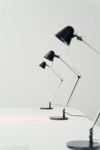
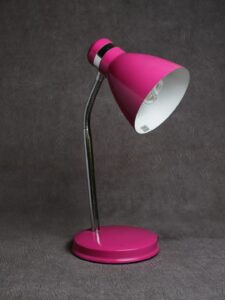
Start with 90+ CRI from a maker that publishes believable specifications. For occasional drawing, hobby painting, and general making, that is usually the sensible middle ground.
Move to 95+ CRI when pigments, thread, paper, or prints must be matched closely. Check R9 too: a strong red score makes the headline CRI figure more reassuring for warm reds, pinks, browns, and skin-like tones.
Then choose the practical parts: a beam wide enough for the work area, dimming for delicate work and bright setup tasks, and a clamp, base, or long arm that puts light where it is needed without blocking the hand.
Before keeping a lamp, compare real materials beside a daylight-lit window. This reveals obvious shifts, though window light, screens, and the final display room will still change how colours appear.
The useful stopping point
- Prioritize published CRI and R9 data over vague “daylight” labels.
- Treat daylight comparison as a practical check, not a laboratory verdict.
A well-positioned 90+ CRI lamp is enough for most art desks. Extra fidelity matters most when small colour differences affect the finished result; beam control and mounting determine whether that fidelity is comfortable to use.
